Different Colours evoke different emotions & different feelings !
Although you might not believe it, Printing and Branding Colours have the power to affect human behaviour and emotion. Designers use Printing and Branding Colours in custom product packaging, outdoor branding, and other marketing materials to influence consumer behaviour. They take advantage of colour symbolism and use it to sway people into buying a brand’s products.
Here are descriptions of the different meanings of colours in print and how to use them when designing for your business:
Seeing Red

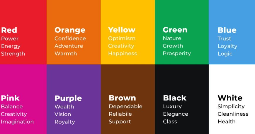
Red is synonymous with intense emotions. It is often associated with excitement, passion, energy, and action. However, red is also linked to negative ideas such as anger, aggression, and danger.
Many brands, especially those in the food industry, use red in their branding to provoke excitement and passion and to stimulate appetites. Some notable brands that use the Printing and Branding Colours red in their branding are Coca-cola, Youtube, and H&M.
View our Red themed products here
Happy Orange Colour

If you want to stand out from the crowd, consider using orange. Orange is a playful Printing and Branding Colours that contains the warmth of red and the joy of yellow. It represents creativity, adventure, enthusiasm, success, and balance.
Though it’s not as popular or commanding as red, it still packs an energetic punch. Many designers use orange as a way to stand out and to bring a bit of fun to any marketing material. Some notable brands that use orange are Nickelodeon and The Home Depot.
View our Orange themed products here
Sunny Yellow Colour

Yellow is all about expressing accessibility and friendliness. Yellow is the most cheerful of Printing and Branding Colours. It is linked to happiness, positivity, optimism, and friendliness.
Businesses use yellow to appear more energetic, warmer, and youthful. Some brands like Ferrari, Ikea, and Shell use yellow to give off feelings of happiness, optimism, and carefreeness.
View our Yellow themed products here
Green Thumb Colour

Cool Printing and Branding Colours like green have a calming and soothing effect on people. It is often associated with nature, growth, money, prosperity, fertility, health, and generosity. However, it is also linked to negative concepts such as envy.
Many businesses related to health and nature use green as a way to emphasize their connection to nature. Those in the real estate or finance industry use green to emphasize wealth and money.
View our Green themed products here
Feeling Blue Colour

Make sure you’re taken seriously by using blue in your branding. Many people associate this Printing and Branding Colours with positive concepts such as intelligence, trustworthiness, honesty, maturity, seriousness, wisdom, cleanliness, and security. Unfortunately, it also linked to depression and sadness.
Blue is used by brands to appear more mature but still give out an air of stability, harmony, and trust. Many social media sites such as Facebook, Twitter, and Skype use the colour blue to relax people as they scroll through their newsfeed. The toothbrush brand Oral B, on the other hand, use blue to position themselves as reliable and safe.
View our Blue themed products here
Born to the Purple Colour

Purple is often dubbed as a royal Printing and Branding Colours. It contains the passion of the colour red and the serenity and calmness of blue. It also has a hint of femininity to it as well. Many associate this colour to concepts such as power, nobility, luxury, wisdom and spirituality. Too much use of this Printing and Branding Colours makes people think of frustration and arrogance.
If you want to appear as luxurious and cutting-edge, use purple in your branding. Big brands such as Hallmark and Yahoo use purple in their logos.
View our Purple themed products here
Tickled Pink Colour

People consider pink as red’s sweeter and softer cousin. It is a popular choice for brands that target female audiences. While it is commonly associated with romance and femininity, some also associate it with modernity, playfulness, luxury, sweetness, charm, and unconditional love.
Brands such as Victoria’s Secret and Barbie constantly use pink not only in their branding but also in their marketing materials as well.
View our Pink themed products here
Earthly Brown Colour

If you want your brand to say “all-natural” and “organic”, use the Printing and Branding Colours brown. Brown is a natural and neutral colour that is great as a background colour.
It often represents stability, reliability, dependability, approachability, nature, wholesomeness, elegance, security, home, warmth, perfection, and honesty. However, some consider brown to be dull.
Brown is rarely used by businesses in their branding. Businesses who do have brown in their branding use it to appear rugged, masculine, and serious. Others pair it with the green to appear warm, organic, and natural.
View our Brown themed products here
White Flag Colour

White is the presence of all colours. It is a neutral colour just like black and grey. Many associate this Printing and Branding Colours with innocence, purity, safety, illumination, sincerity, softness, perfection, goodness, cleanliness and humility. However, it is also associated with coldness, sterility and, in some cultures, death.
Some brands use white to seem flexible, simple, young, and economical. It is also used as a background colour for product shots and their websites.
View our White themed products here
It’s a Grey area

Grey is a mixture of black and white. It is a neutral and balanced Printing and Branding Colours that is both feminine and masculine, depending on how light or dark it is.
It symbolizes sophistication, maturity, solemnity, formality, and conservativeness. However, it can also mean dullness, dirt, dinginess, loss, and depression.
Brands often use grey as a neutral background colour. They use dark grey to add mystery and light grey to be more accessible.
View our Grey themed products here
Black out themes

Black is the absence of all Printing and Branding Colours. It is considered to be a very intense colour.
It also has negative connotations such as fear, death, evil, gloom, emptiness, grief, and rebellion. Though it can appear very modern and luxurious, too much of this colour can be overwhelming and intimidating.
Many brands use the colour black in their branding to appear more authoritative and powerful. It is also used by many brands to appear more sophisticated, elegant, and luxurious.
View our Black themed products here
After understanding the symbolism of colours, which one will you pick for your branding? Share it with us in the comments below.
This article was first published Helloprint UK as part of their blog posts.
To learn more about design colour please check our this informative Wikipedia article here